
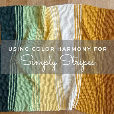

I recently revamped my Simply Stripes Blanket, a fun and easy lap/baby blanket pattern originally published back in 2012. It features six colors of bulky-weight yarn, shown here in Berroco Vintage Chunky.

The blanket pictured here is a newer version my Mom knit for me a few years ago. It became a favorite napping spot for my sweet Alice, especially in her older years when she’d curl up on my office chair during the day.


I know that choosing six colors that work well together can sometimes feel a little overwhelming. Or, sometimes you just don’t know where to start! So as part of the pattern revamp, I thought it would be fun to share how using color theory and different color harmonies can help guide the process and provide a starting point for creating your own palette.
Below I’ve provided 6 potential color harmony ideas:
- Analogous
- Monochromatic
- Complementary
- Split-Complementary
- Double-Complementary
- Hexadic.
For each one I’ve included examples using two yarns: Berroco Vintage Chunky (used in my original pattern), and Ewe Ewe Yarns’ Baa Baa Bulky, whose color palette was actually designed with the color wheel in mind!
One important thing I like to mention: yarn colors don’t always line up perfectly with the color wheel, and availability can also be limited. So when it comes to picking yarn colors using color harmony theories, I often recommend to use it as a general guideline rather than strict rules. A loose interpretation can work just as well!
Idea #1: Analogous
An analogous color harmony uses colors that sit next to each other on the color wheel, creating a gradual transition from one hue to the next. The newer version my Mom knit is a good example of an extended, analogous-inspired palette. It features orange, yellow-orange, yellow, yellow-green, and blue-green, with white added as a neutral.

It’s not a strict analogous harmony since the colors span a fairly wide portion of the color wheel, but the overall effect is still a gradual progression of related hues. I think this is a great place to start when picking colors – choose several neighboring hues on the color wheel and you’ll create a a really pretty color progression across your blanket.


Idea #2: Monochromatic
A monochromatic color harmony uses variations of a single hue, ranging from light to dark and sometimes varying in intensity as well.

This is a pretty simple approach to choosing colors, although it helps to work with a yarn that has a more extensive color palette. You’ll need enough variations within one color family to create six distinct colors. But you can also consider adding neutrals if you are limited.
I’ve created a few different examples below – Berroco Vintage has an ocean-theme, Ewe Ewe has a forest-theme, and then I created a neutral version out of Vintage (to show how monochromatic works with neutrals as well).


Idea #3: Modified Complementary
A complementary color harmony uses two hues that sit opposite each other on the color wheel. Classic examples include blue/orange, yellow/purple, and red/green. But how can we take a two-color harmony and make it work for a blanket that requires six colors? One approach is to combine complementary and monochromatic harmonies (a little color-harmony mash-up!).
Start with two complementary hues, then choose two additional variations of each, using lighter or darker shades within those color families.
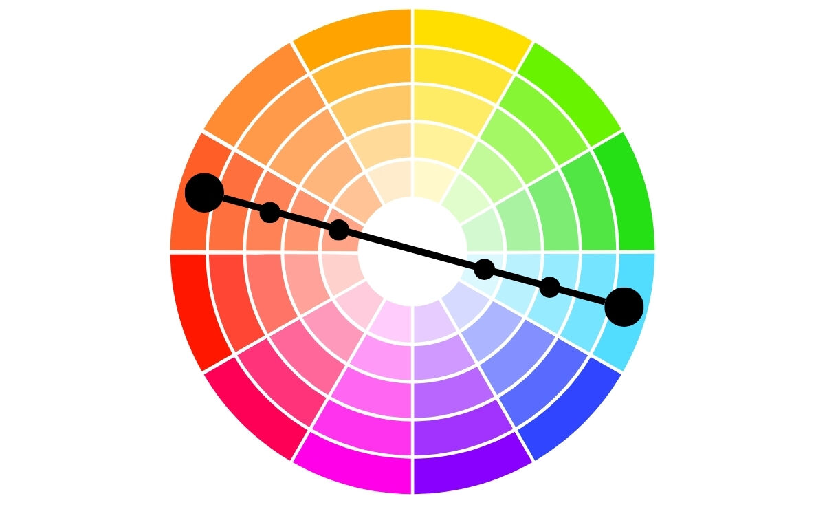
For the example below, I’ve chosen red-orange and blue-green as my complementary pair. I then selected two additional variations of each, creating a six-color palette. I’ve arranged them with the darkest colors at either end, gradually transitioning toward lighter colors in the center.


Or, here’s another arrangement using those exact same six colors. But this time instead of a gradual light-to-dark progression, I’ve mixed up the values while still keeping the darkest colors at the ends. It’s a great example of, no matter the color harmony, you can play around with placement.


Idea #4: Modified Split-Complementary
A split-complementary color harmony starts with one base hue and then uses the two hues on either side of its complement on the color wheel.
For example, you might start with magenta and pair it with yellow-green and yellow-orange. To expand this into six colors, I’ve chosen two variations from each of those three color families, playing with lighter and darker values.
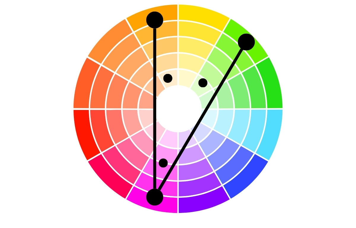
As you can see in the example below, I also experimented with the order, arranging the colors so that the more saturated hues provide contrast against the lighter ones.


Idea #5: Modified Double-Complementary
A double-complementary color harmony uses two pairs of complementary colors. For example, magenta + yellow and red-orange + blue-green. But that gives us just four colors, so one way to modify this harmony is to add two neutrals to the palette. Or, you could choose lighter or darker variations of two of the original colors.

Below is an example of this type of palette, which I actually used for my Brightside Cowl! This is another project that uses six colors of bulky-weight yarn, so if you’d like to experiment with any of these color harmony ideas on a smaller project, it’s a great option.


Idea #6: Pentadic/Hexadic
A pentadic color harmony uses five hues spaced approximately evenly around the color wheel. Since Simply Stripes calls for six colors, we can take a similar approach using six hues, sometimes referred to as a hexadic harmony.

This approach creates a colorful palette with hues drawn from all around the color wheel. It’s a fun option if you want a blanket with lots of color and contrast! But if you prefer something a little more subdued, you can always opt to choose softer, muted variations of those hues.


A Final Thought…
I hope exploring these 6 color harmonies has been helpful, whether it’s for the Simply Stripes blanket or another project you have in mind. Although following these harmonies exactly might not always be an option depending on a yarn’s color options, understanding these harmonies and using them as a jumping-off point can be so helpful and fun exercise as well!
Many art supply stores and yarn shops sell color wheels if you would like to have a physical wheel handy (I have a few of them myself!). But you can also find some basic visuals of them online and save them on your phone so you have it handy the next time you visit a yarn shop.
Below is one I love that is actually sold as an interior designer’s color wheel, and I feel like the shades/tints they use are more in line with yarn colors, so I personally find it a helpful resource for my visual-brain! But I’ve also seen this cute one recently from the Cashmere Goat Yarn Shop in Camden, ME from Twice Sheered Sheep.
