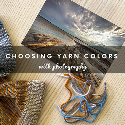
Just about 2 years ago I released my Winslow Park Cowl pattern. My goal with this design was to create a small project that included multiple “skill building” techniques (specifically, working a knitted turned-hem and working 1-round helical stripes). But the other thing I wanted to teach with this piece was an alternative way to come up with color pairing options and so that is the topic of this blog post!
I named this cowl “Winslow Park” because the colors in this cowl were inspired by a photograph my husband Jeff took at Winslow Park, a lovely town park here in Freeport, Maine with views of Casco Bay. Here is the photo:
I was just so captivated by this photo, especially the colors. I chose to use Manos del Uruguay Silk Blend, a DK yarn that has lots of beautiful colorway options. And using the photo as my inspiration, I chose 5 colors that mimicked the shades I saw in the photo:
I did something similar with my Magic Hour shawl as well. Here was the photograph from Jeff that really captivated me:
I was immediately drawn to the colors of course! The pinks/purples in the clouds with the bands of yellow on the horizon just completely amazed me. And when visiting the yarn shop Wool & Co a couple of months after this photo was taken, I saw an interesting yarn that just so happened to have colorways reminiscent of this scene. I purchased 1 skein of each color, and designed this shawl with it:
Jeff took the photo just after sunrise, and often the term “Magic Hour” is used by photographers to describe either the first hour after sunrise or the hour before sunset. The light can be just gorgeous at this time, as definitely was the case this particular morning. So “Magic Hour” seemed like the perfect name for this design!
If you’re interested in using a favorite nature-scene photograph as the source of your color pairing inspiration, I have some tips that you may find helpful. Keep reading to learn more!
If you’re not sure what colors to “pull out” of a photo, utilize technology
Adobe has a fabulous color theme generator online that allows you to upload a photo and it will generate different color palettes for you based off of the photo! Cool, right? Let me walk you through how to use this tool:
Step 1: Go to: https://color.adobe.com/create/image
Step 2: Drag your photo image as instructed:
Step 3: Right away Adobe will generate the first color palette for you. If you look on the left-hand side, you’ll see that they provide 5 different “color moods” you can pick from. The first option displayed is “colorful”, but you can click on any of the other moods to see other options.
When I clicked on “bright” I noticed that the 5 colors they pulled were quite similar to the 5 colors I had chosen for my cowl! So at least I know I was on the right track 🙂
You can also play around with color harmonies
If you look at the screenshot above, we’re currently under the “extract theme” menu. Which makes sense – we’re extracting color themes from a photo! But if you want to now take one of those themes and apply color harmony rules to it (i.e, complementary, analogous, square, etc), you can click on the menu item to the left which is “Color Wheel”. You can then choose from the drop-down which color harmony rule you want to look at:
In the above screenshot I have chosen the “square” color harmony. It took one of the colors from my photo (the middle one) and then picked 4 additional colors based on the square color theory. So this could be another 5-color inspiration pairing for the Winslow Park Cowl. Note: if you wanted to base it off of a different color from your original theme, simply go back to the “extract theme” screen and move the color you want as your “base” to the middle position (by dragging and dropping).
If you are looking for just 2 colors for your project, you can select “complementary” and then choose one of the options that is on the opposite side of the color wheel as your “base” color. As you can see below pairing one of the oranges/browns with one of the blues (opposite side) would create a complementary color pairing.
So whether you are looking for 5 colors to go together or just 2 (or somewhere in-between), you can play around with these different color harmonies to find the right inspiration for you.
This tool can provide a great starting point
I have found that utilizing tools like this Adobe one can be so helpful as a starting point for color pairing inspiration. Of course depending on the yarn you have chosen, you may be a bit more limited in what colors you can actually choose for your project. But that is why I say utilizing these tools can be a good starting point and help point you in the right direction! And it’s such a fun way to take a favorite photograph of nature and incorporate it into a knitting project.
If you would like to learn more about the Winslow Park Cowl in particular, click here for the pattern page! Or for Magic Hour shawl, click here.


