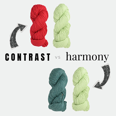

Choosing colors for a two-color knitting project can feel tricky. Sometimes you want the colors to really stand apart and make a statement, and other times you want them to blend together in a more subtle way. This is where the ideas of contrast and harmony come in. They’re simple concepts that can make color decisions much easier.
What is ‘contrast’ and ‘harmony’?
Contrast is when colors stand out against each other and grab attention by highlighting their differences.

Harmony is when colors create a sense of unity and balance by emphasizing their similarities. There can still be some contrast, but it can feel less dramatic.

How are contrast and harmony achieved?
Contrast can be achieved in a few different ways. One common method is choosing complementary colors, which are opposite each other on the color wheel (like yellow and purple). Another is pairing colors with very different values, such as a light color with a dark one.

Harmony works a little differently. Instead of emphasizing differences, it highlights relationships between colors. One way to achieve harmony is by choosing analogous colors – colors that sit next to each other (or with only one color between them) on the color wheel. Another approach is using monochromatic colors, meaning different shades, tones, or tints within the same color family.

When should you choose each?
High contrast colors make motifs, stripes, etc stand out clearly. This works well for any pattern where the design needs to be easy to see (or you want that ‘pop!’).
Here are some examples of my designs where the colors had a strong contrast:


Harmonious colors blend more gently together. It creates a softer, more subtle relationship between the colors (less ‘pop’, more ‘blend’).
Here are some examples of my designs where the colors had harmony:


How subjective is the choice?
Some designs actually rely on contrast in order for the motif or stitch pattern to be visible. But even with colorwork (whether it’s mosaic, stranded or stripes), it’s completely up to you how much you want to prioritize that “pop.”
Here’s an example from my days working at a yarn shop (and taking photos of shop samples). Below are two samples of the Northman Mittens pattern by David Schultz. On the left, the colors are more harmonious – you can still see the motif, but the effect is softer and more subtle. On the right, the colors have stronger contrast, so the motif really pops.

Stripes are another great example of how contrast and harmony can change the overall look of a design. Sometimes you want that dramatic pop between colors, and other times you may prefer something more subtle that blends together more gently.
Below is my Coffee Bean Cardigan pattern showing an example of strong contrast. In my version, I paired a very light gray with a deep brown-red, which really emphasizes the stripes.

And here’s a version from a fellow knitter, Jane from the UK, who knit her own Coffee Bean using more harmonious colors (click here for her Ravelry page). I love the softer, more subtle effect!


Green and blue sit next to each other on the color wheel, making this a great example of analogous colors creating a harmonious color combination. And by choosing colors of similar value (how light/dark a hue is), her color effect provides that gentle, blended look.
A little more contrast could have been added by choosing colors with more opposing color values (i.e, a slightly darker green with the light blue, or a slightly darker blue with the light green).

Contrast is a spectrum
As I noted above, contrast can be a spectrum. Think of it like a volume knob – you can turn it way UP or way DOWN by adjusting a colors shade, tone or tint.
Let’s use the color magenta as an example. For contrast, you can pair it with a neutral or pair it with it’s complementary color in the yellow/green family.

You could pair it with stark white or light green and you’ve turned the contrast way up. Or, you could turn the volume down and pair it with a medium neutral like beige or a medium green.
Now let’s take the same magenta color and for harmony, you can pair it with an analogous hue like orange or a monochromatic hue.

You could play with color value (how light or dark a color is) to add contrast to these harmonious pairs. Opposing color values (such as in the top row) adds a bit of contrast while similar color values (such as in the bottom row) keeps the contrast more subtle.
Contrast or harmony – which do you prefer?
My biggest tip is to start noticing color combinations everywhere in your daily life – home décor, clothing, nature, or even packaging at the grocery store. Pay attention to the combinations that catch your eye. I actually keep a folder on my phone full of color-play inspiration. You might be surprised by the types of contrast or harmony you naturally gravitate toward!
Here’s a totally random example from just yesterday. I was sitting in a doctor’s office and noticed a sign on the door with a color combination that immediately caught my eye. It’s no surprise it stood out, because blue and orange are complementary colors – they sit opposite each other on the color wheel and naturally create strong contrast. When I got home, I looked up a blue and orange pairing that felt similar and would translate well into yarn colors, as you can see in this graphic.

Here’s another example from the non-knitting world – art! Below is Van Gogh’s Sunflowers, a great example of a harmonious color combination using the analagous color scheme.

So the lesson is, you never know when or where color inspiration might strike! Whether sitting in a doctor’s office or admiring art – there are inspiring color pairings everywhere.
I hope it’s been helpful learning more about contrast and harmony, and I hope it helps to inspire you the next time you need to pick 2 colors in a knitting project!