
Have you ever needed to pick 2 (or more) colors of yarn and you just weren’t sure if there would be enough contrast between them to provide the level of “pop” you were looking for? I have an easy tip to share that can help with this situation.
But first, let’s talk about one important concept and that is color value.
What is color value?
Simply put, it’s how light or dark a color is. For the strongest contrast between 2 colors (so that one pops against the other) you would want to pair opposite values together. So the further the values are from each other, the higher the contrast. The closer the values are from each other, the lower the contrast.
Example #1: High, Medium and Low Contrast Pairings
Check out the skeins below of Malabrigo Rios (courtesy of woolandco.com). The high contrast colors have opposite values (Dark Teal and Natural), the medium contrast colors have far apart values (Dark Teal and Light Teal), and the low contrast colors have similar color values (Dark Teal and Dark Orange).

But perhaps seeing the difference between these color values doesn’t feel obvious to you when looking at the skeins like this. One popular trick I learned back in my yarn shop days that you may have heard about before is this:
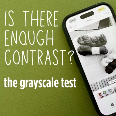
Take a photo of your potential color pair and use a grayscale filter to easily compare color values.
How does viewing yarn in grayscale help you to see contrast better?
Viewing a photo in grayscale remove’s a color’s hue and saturation and so all you’re seeing is their color value.
Using our above Malabrigo skeins again, the image below shows the skeins in full color but underneath shows those same skeins in grayscale mode:

And so without the color distraction, seeing the color value difference between the skeins becomes easier.
- As you can see, the Dark Teal/Natural skeins indeed have the highest contrast – in grayscale mode they look completely opposite.
- But then look at the Dark Teal/Dark Orange skeins – there’s hardly any contrast between them in grayscale so they will indeed have low contrast.
- Then in the middle with our Dark Teal/Light Teal skeins, you can see a difference between them – not as much as the cream skein but definitely more than the dark orange. So calling it a medium contrast indeed seems appropriate.
Another example
I have a cream color skein of Malabrigo Rios and let’s say I’m unsure whether to pair it with a yellow or a red, and my goal is high contrast. Let’s look at both options in grayscale to compare which may contrast more:

As you can see above, both options show contrast, but there’s more contrast with the red. Here’s another view:

How to take or edit a photo in grayscale
If you would like to take a photo in grayscale mode (or at least use your phone itself as a filter to view grayscale in real-time): Most phones will allow you to turn the entire phone into grayscale mode (typically a feature under “accessibility”). On an iphone, you go to settings > color filters > on > grayscale
To edit an existing color photo and turn it into grayscale, there are a couple of options to try:
- Option 1: Under photo adjustments, turn the saturation ALL the way down. This removes the color and replicates grayscale mode pretty well.
- Option 2: Under photo filters, there are typically a few black and white filters you can choose from. It depends on your phone/editing software, but in my example below, I just used the “mono” b/w filter on my iphone.
How do the above 2 options compare with true gray-scale mode? I conducted a little test myself to compare and see if they were just as good, using some Berroco Talara skeins I had in my stash (red/brown, purple and cream).
The below image shows the same photo in these 3 different modes: true grayscale, saturation turned down and a b/w filter:

So based on the above, although different adjustments/filters provide different grayscale looks as they show different intensities, each filter still provides a good comparison of color value. So I think using any of these options for this type of exercise can definitely work since the goal is comparing color values.
Do you always want contrast?
This exercise is often used as a way to ensure that you’re getting the most amount of contrast as possible. But keep in mind, sometimes contrast isn’t the goal. For example, if you’re making a striped sweater, you may want bold, contrasting stripes OR you may want a more subtle look that doesn’t necessarily scream “stripes!”.
Here’s an example from the ready-to-wear world that I think demonstrates this well because it’s the exact same sweater but one has high contrast and one has low contrast:

So this is just an important thing to keep in mind that when doing this color value analysis, sometimes you may in fact be looking for low-contrast if subtlety is your goal.
I hope this information has been helpful! Do you have other tips or tricks that have been helpful when comparing yarn contrast? I’d love to hear about it!