When a knitting pattern calls for picking 2 colors, do you ever struggle to decide how to go about making this decision? If so, utilizing the color wheel can be a great resource! I go into more detail about this topic in my upcoming Soundtrack Cowl KAL Workshop (click here for all of the course & enrollment info – it all begins on September 14, 2024!), but I thought in this blog post I’d share one quick tip you may find helpful. This tip pertains to circumstances when you want some contrast between your 2 colors, but you prefer something a bit more subtle.
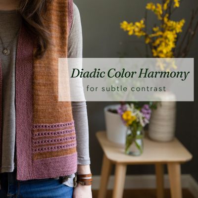
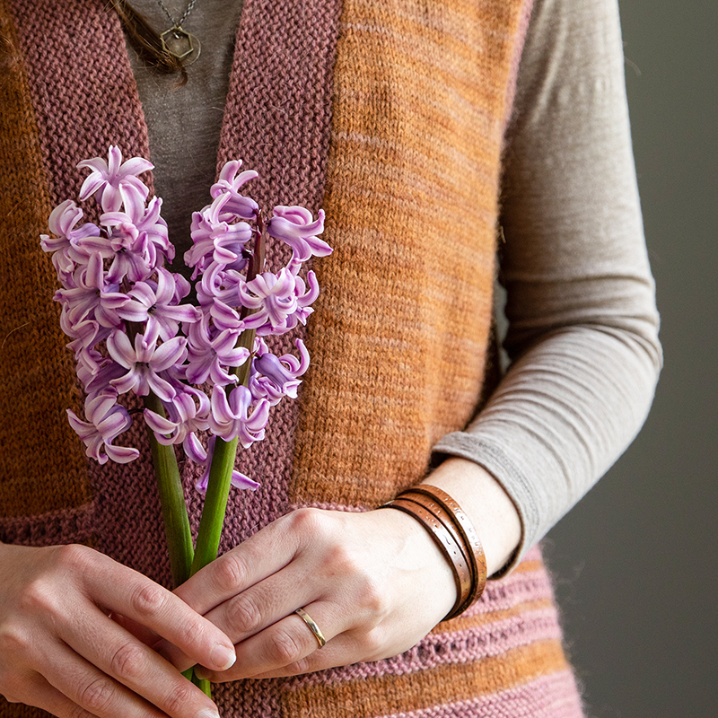
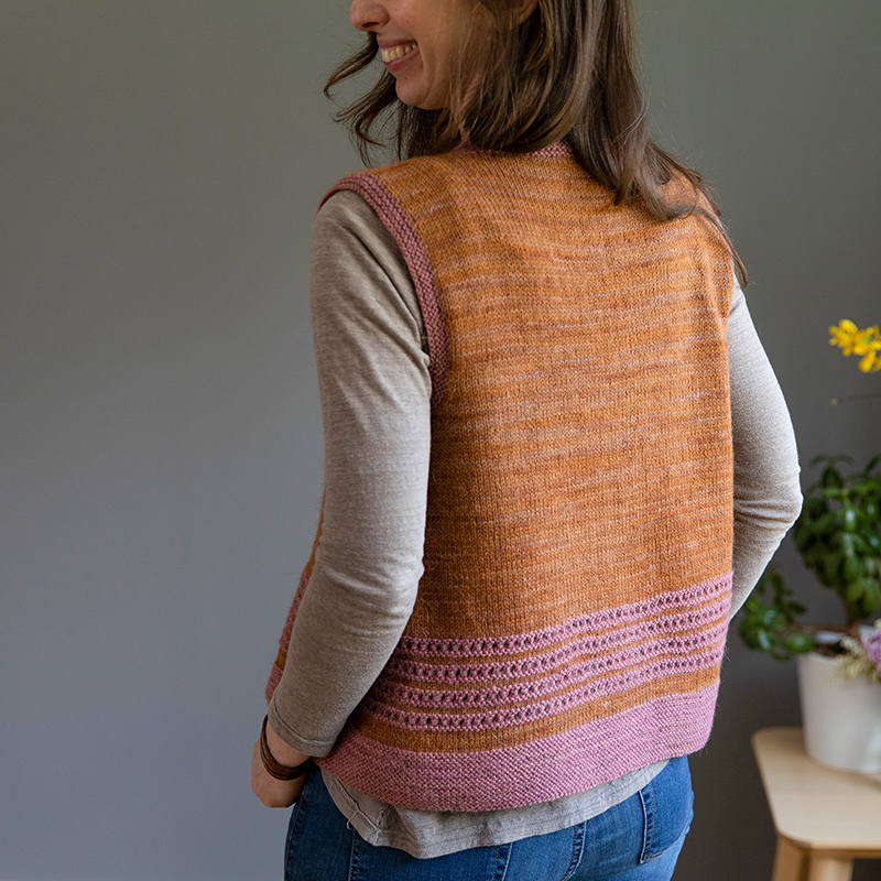
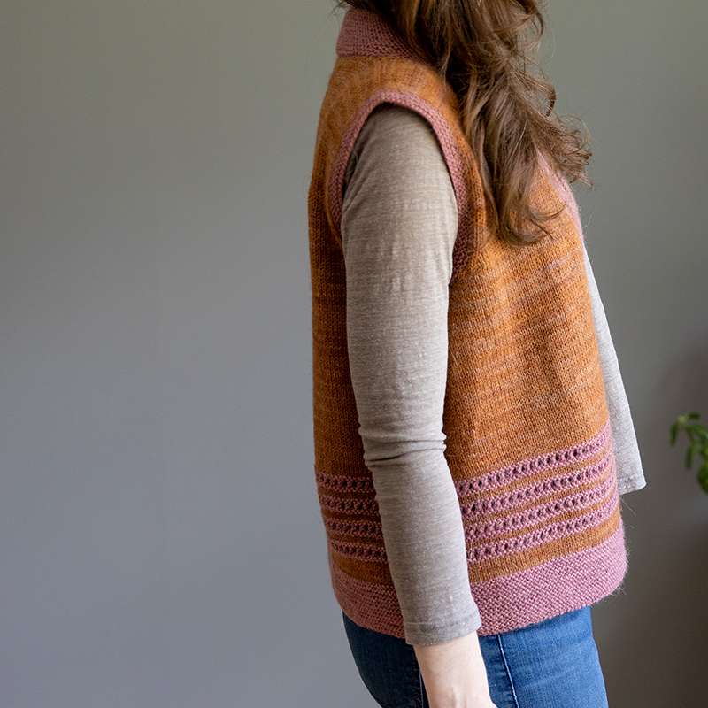
In my Hyacinth Vest, a contrasting color is used for the eyelet bands on the body as well as for the garter stitch bottom hem and front bands.
I didn’t want the contrast to be super strong as I didn’t want the eye to go directly to those contrasting color areas. With the thick garter stitch trim and the garter eyelets that already pop out against the stockinette stitch fabric, I felt that choosing a strong contrast would make those elements appear too heavy. So my goal was to pair 2 colors that were harmonious together which I believe I achieved by pairing orange/brown color with pink/purple. Why does this work? Because they are considered a “diadic” color harmony!
What is the Diadic Color Scheme?
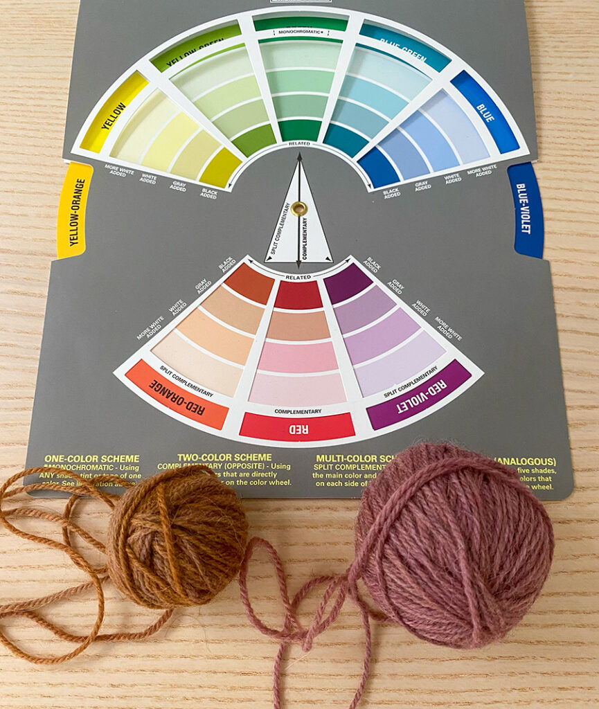
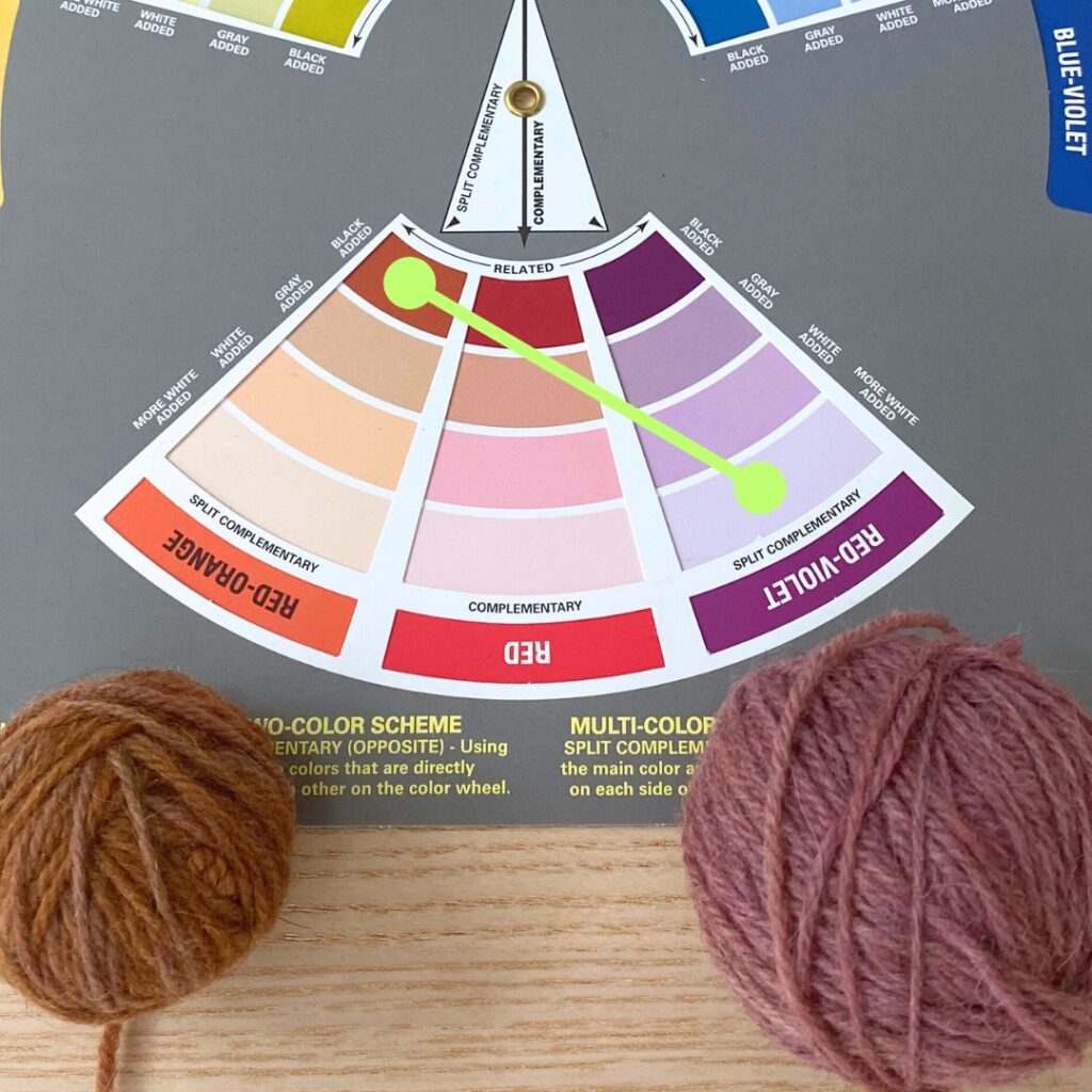
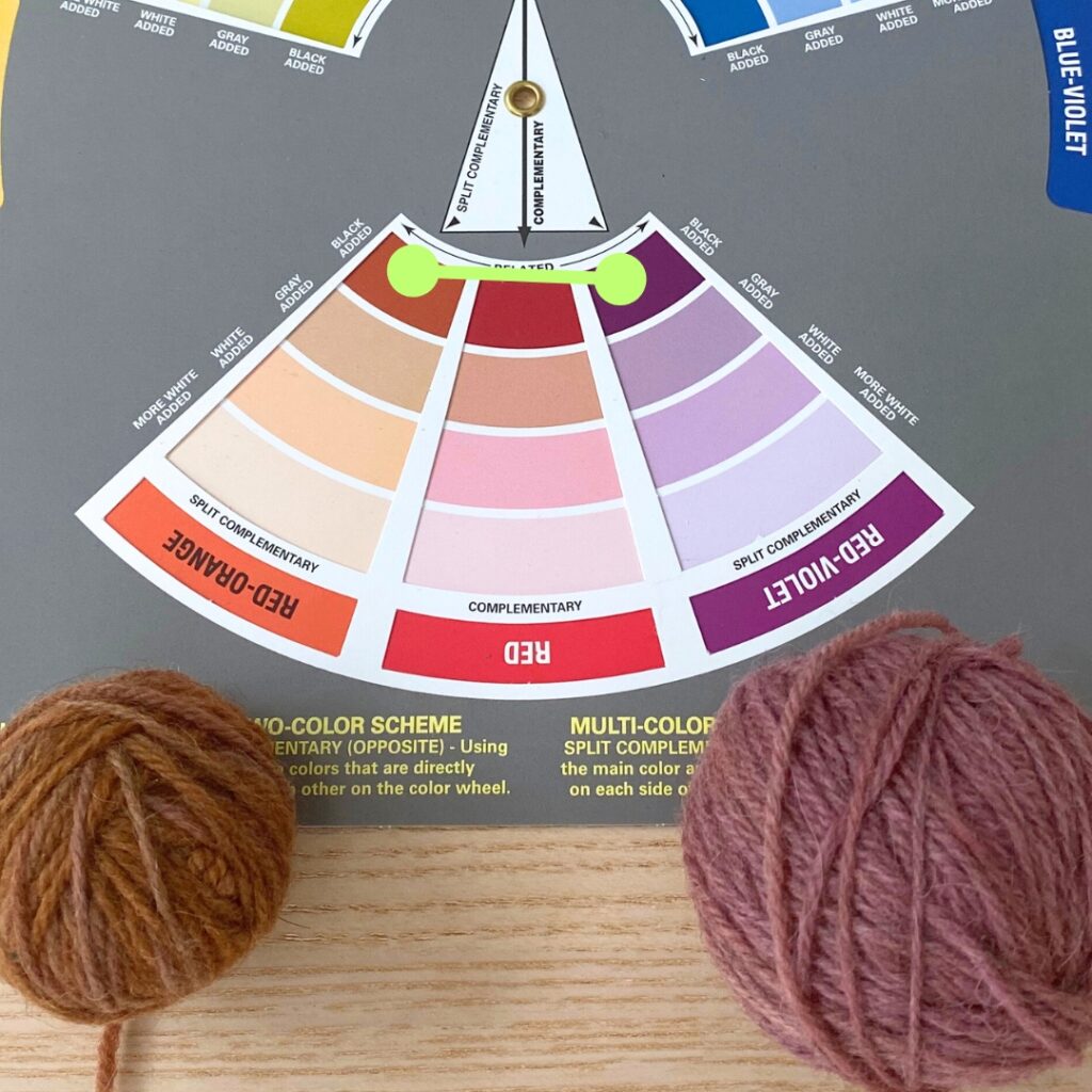
The diadic color scheme or color harmony is when you pick 2 colors that are separated by 1 color on the color wheel. This color harmony provides some contrast between the 2 colors, but it’s more subtle and feels very harmonious. Let’s look at my Hyacinth Vest colors again but this time on a color wheel:
Of course with yarn colors you often can’t match the yarn shade exactly with what you see on the color wheel but you just look for what you feel matches the closest. So in this case, I felt that the main color I had picked fell in the red/orange family and so picking a contrasting color that was in the red/violet family would provide that subtle, harmonious contrast.
Depending on the particular tint/shade of the colors that contrast can be even more subtle or more contrasting. Check out my examples below:
In my Hyacinth, I feel like the color values are similar – they both feel like they are medium values so neither is necessarily “popping” against the other. Instead there is just that subtle contrast. But even if they were to pop more (say the first example above), it still can be a more subtle contrast than, say, a complementary color harmony.
So the next time you’re looking to pair 2 colors together, take a look at a color wheel and consider the diadic color harmony as a way to inspire subtly contrasting color pairing options. And if you’d like to learn more about this topic, plus learn other interesting knitting techniques and tricks, check out my upcoming KAL Workshop for the Soundtrack Cowl – it begins September 14th!
More about the Hyacinth Vest
Interested in trying out diadic color pairing by making your own Hyacinth Vest? This seamless vest is knit from the bottom-up and uses sport or DK-weight yarn (the gauge is 5.5 stitches per inch). I used Alpaca Heather by Manos del Uruguay, a beautiful wool/alpaca blend that comes in a gorgeous palette of colorways.
It’s the type of multi-season layering piece that you can wear in so many different ways and throughout the Fall, Winter and Spring. I have designed it to be open-style, but I’ve also provided tips on my Hyacinth Tips Page about closure options should you prefer that.
The pattern is available for download here on my website or here on Ravelry.

